About My Visual Merchandising Experience
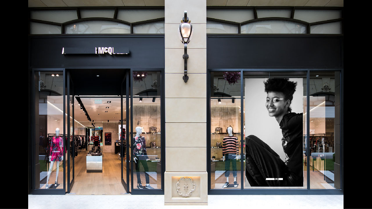
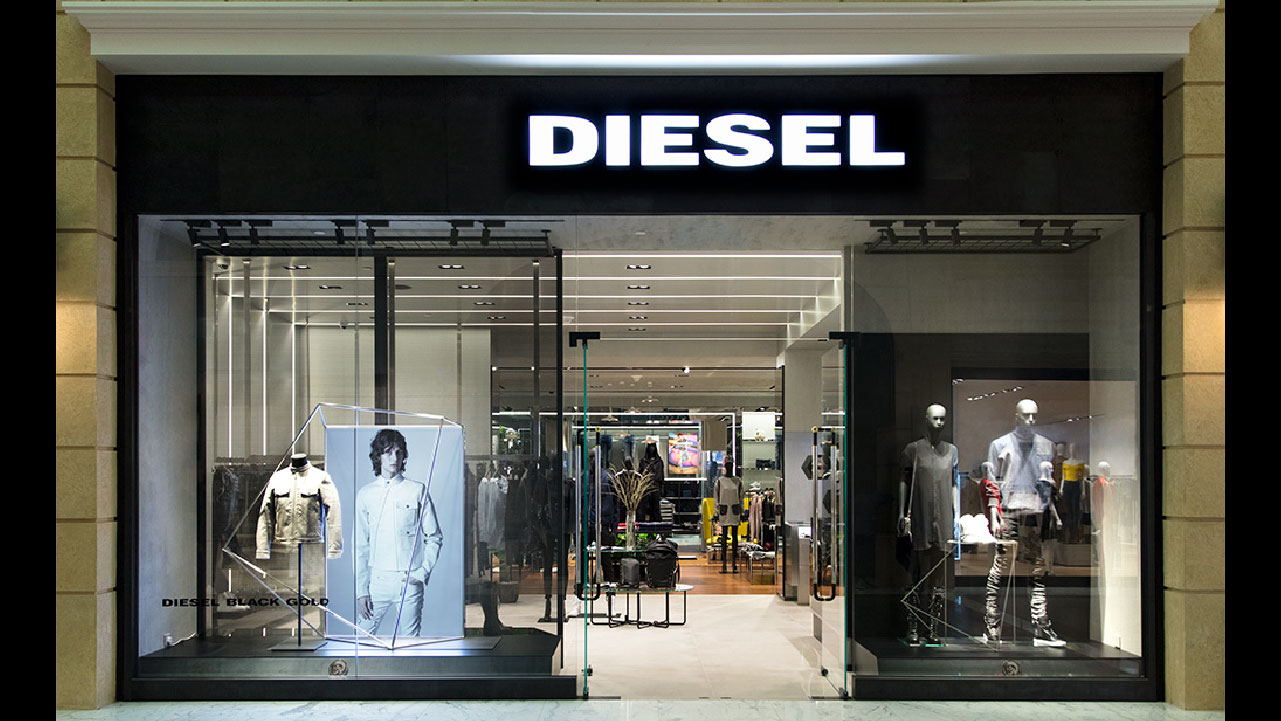
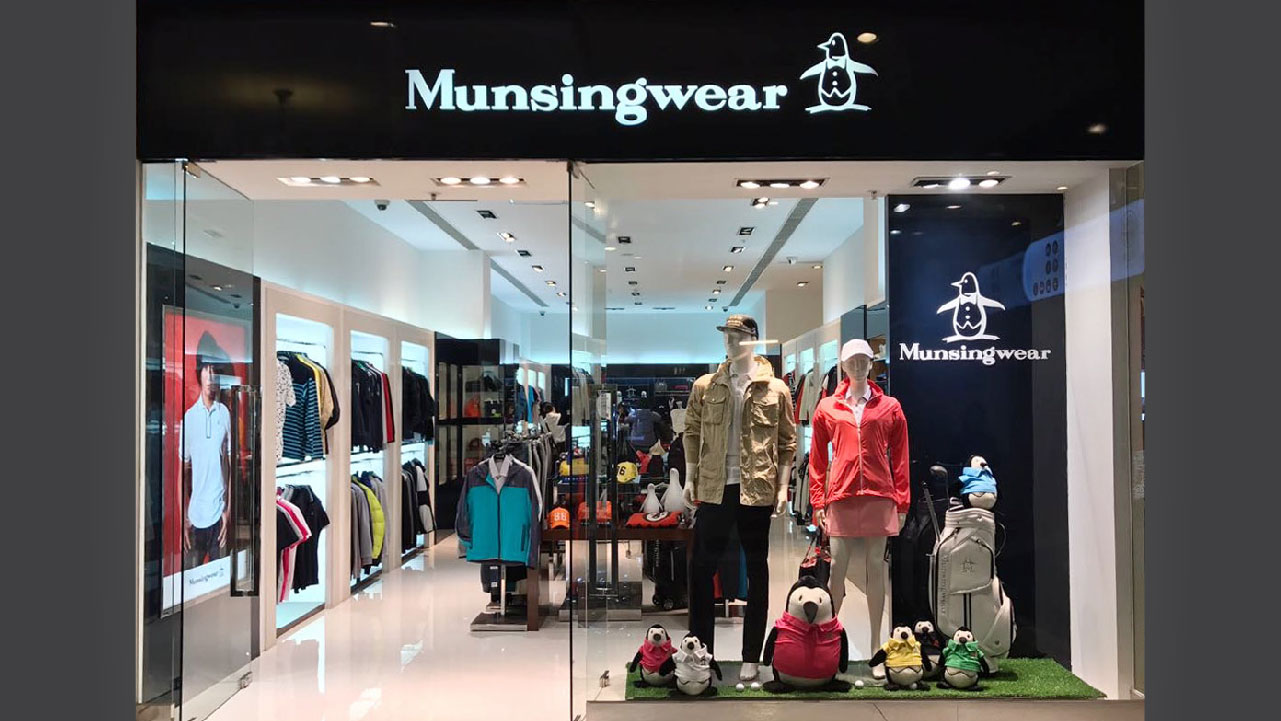
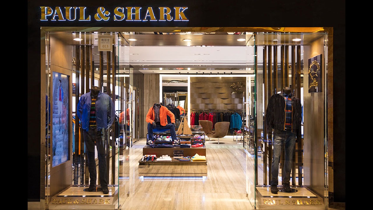
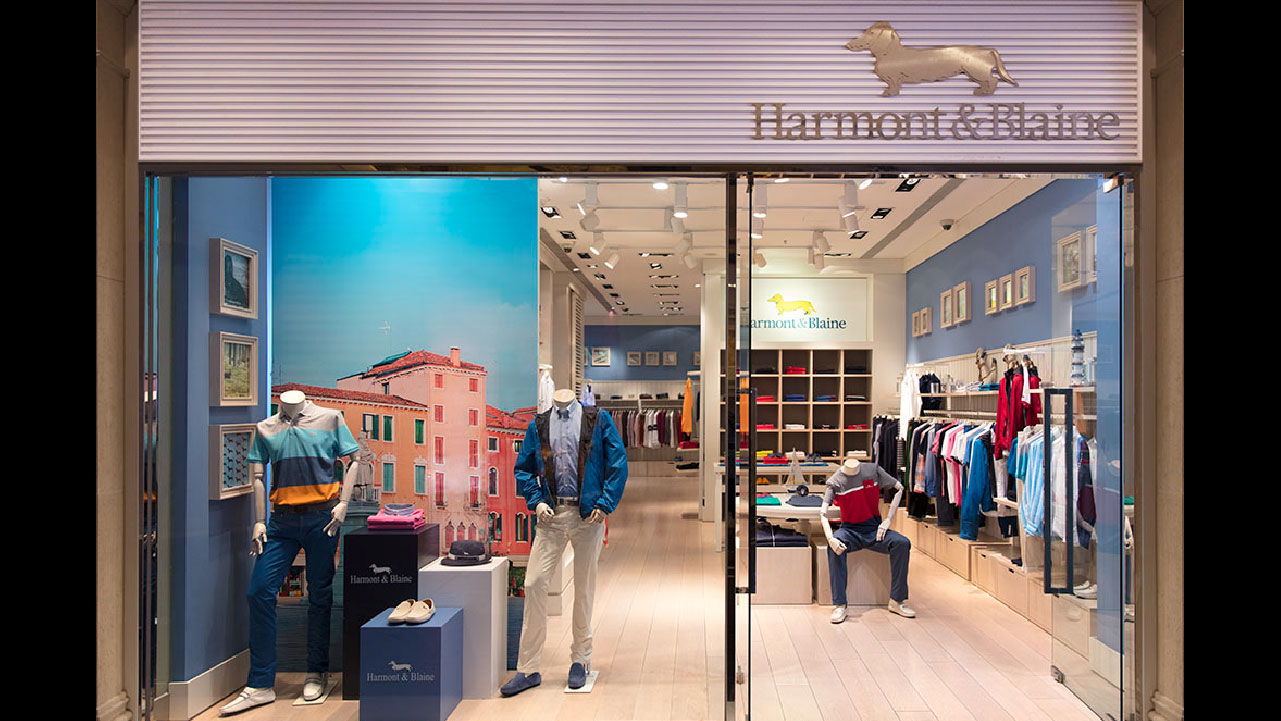
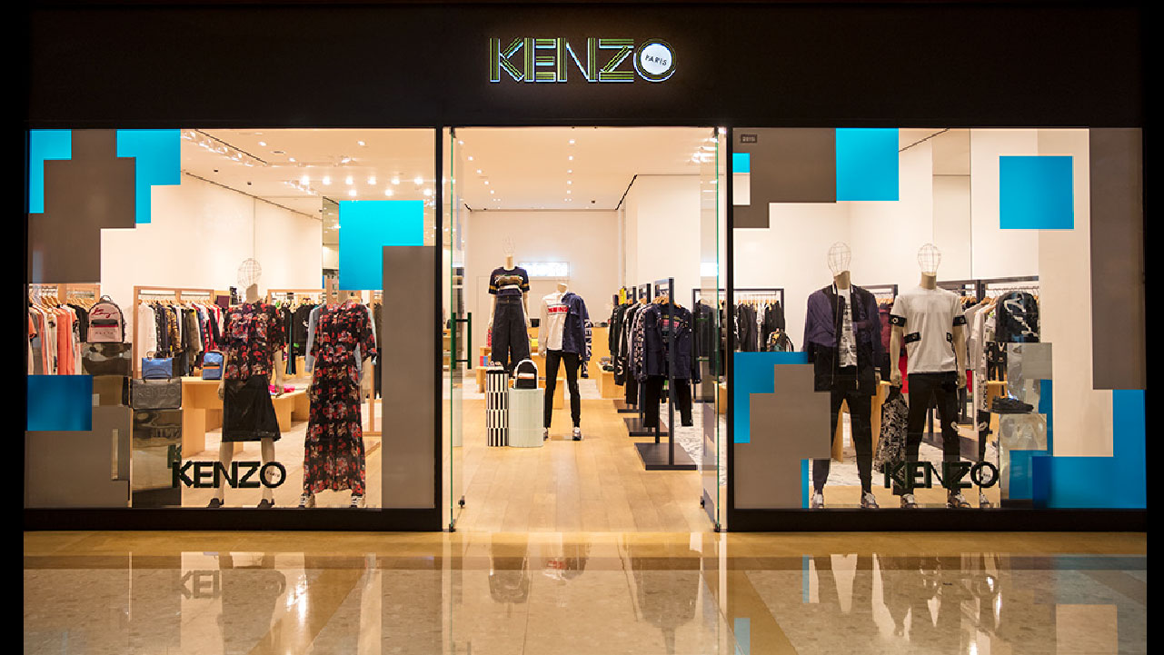
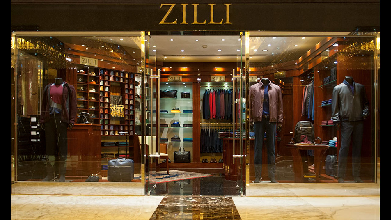
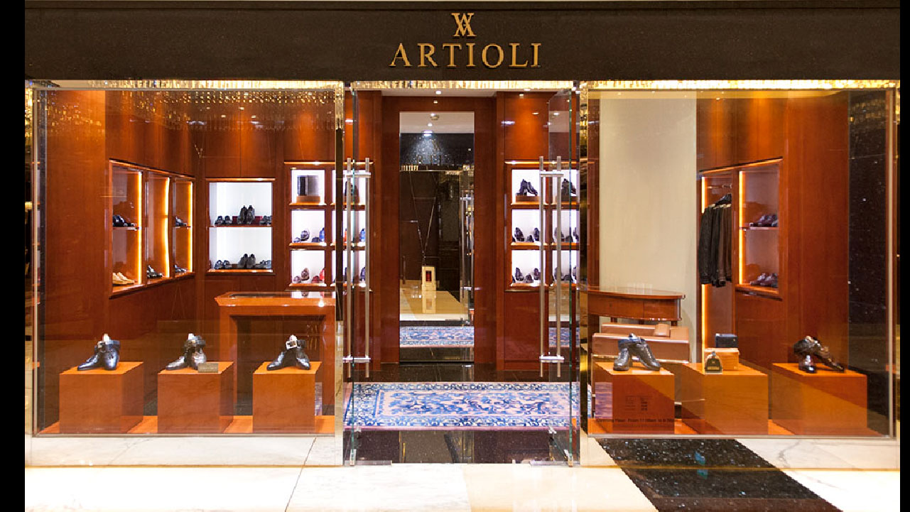
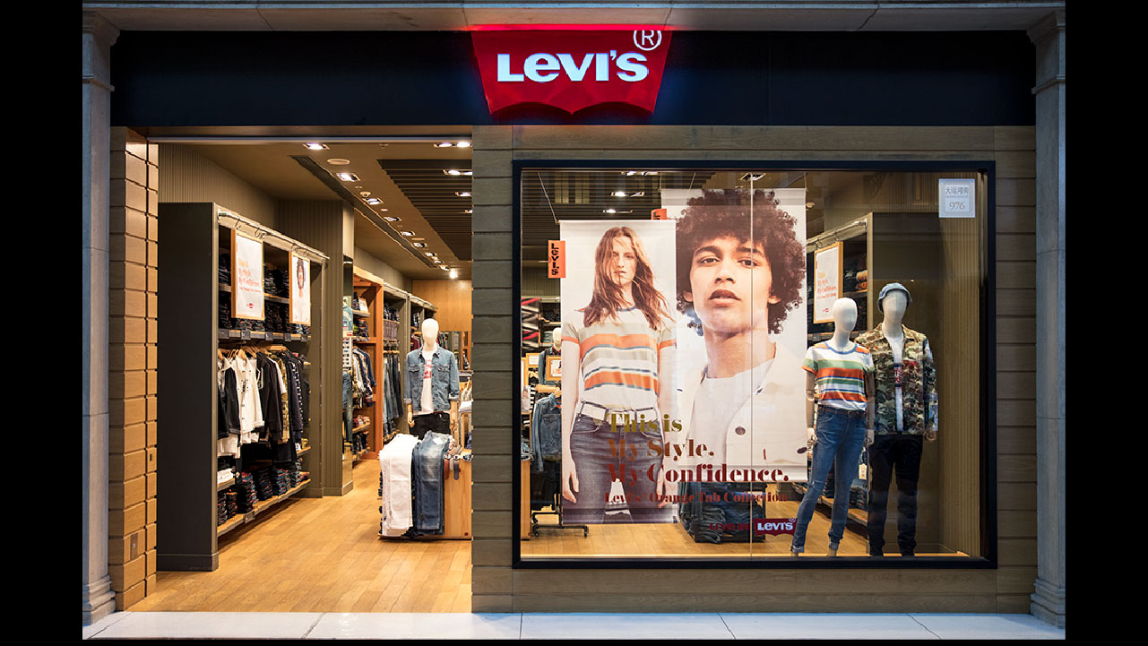
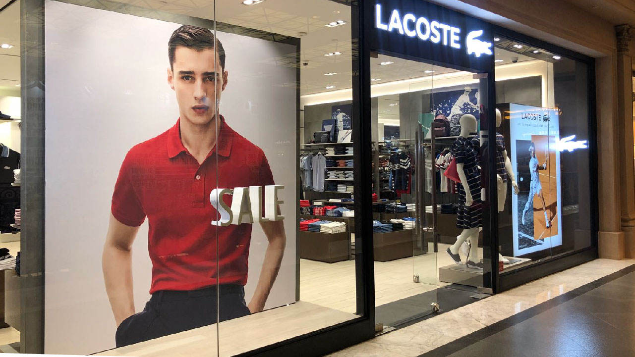
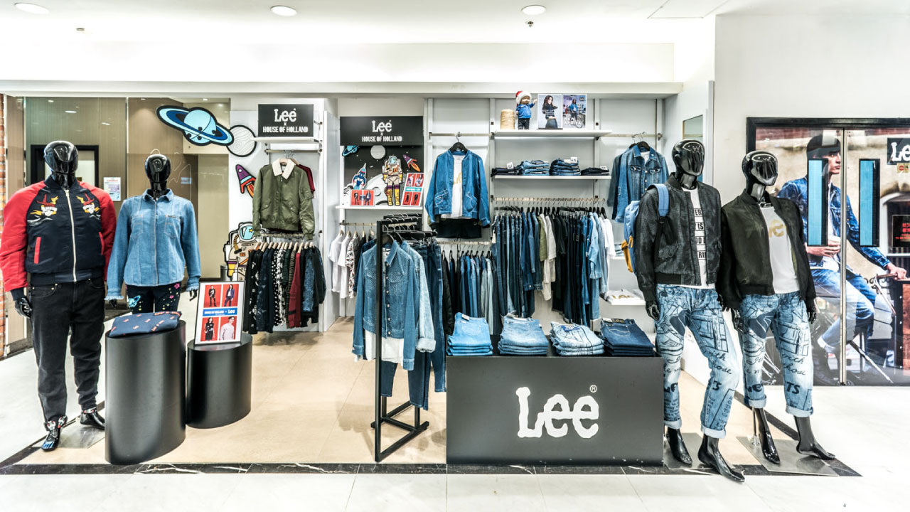
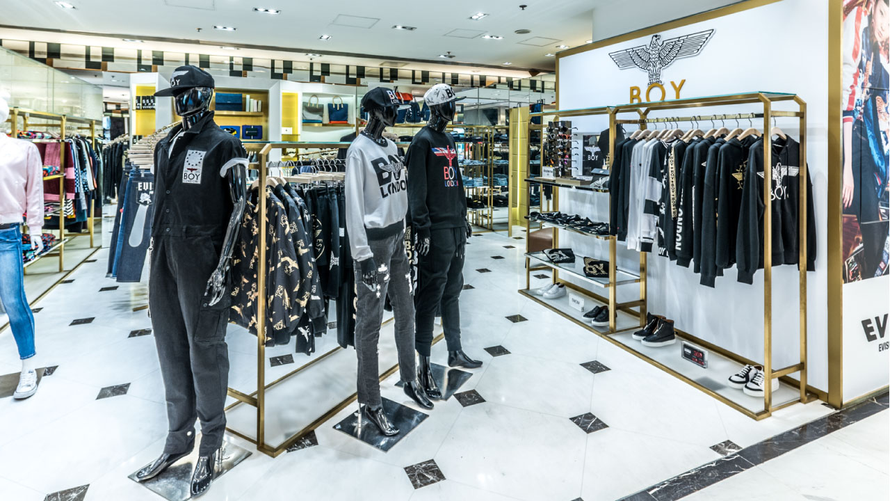
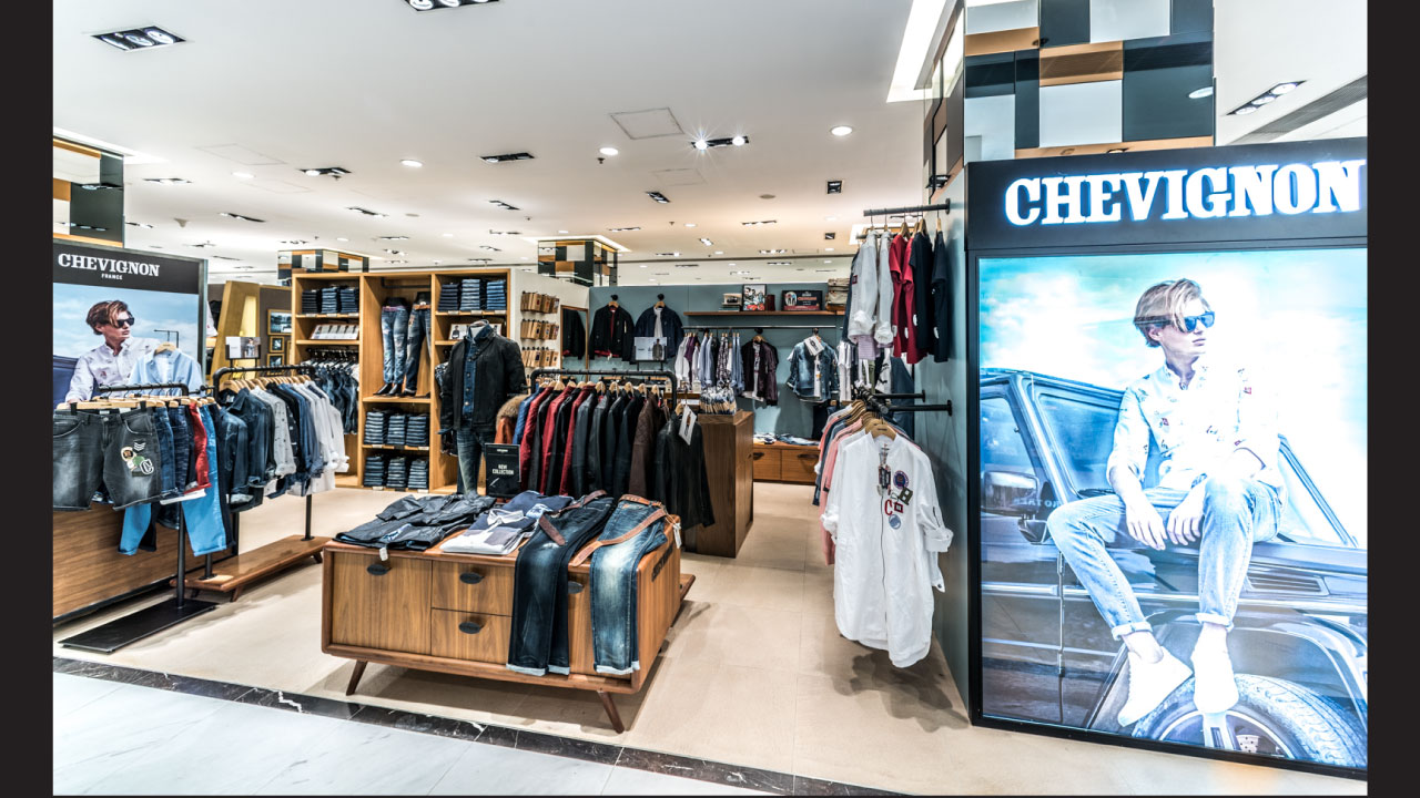
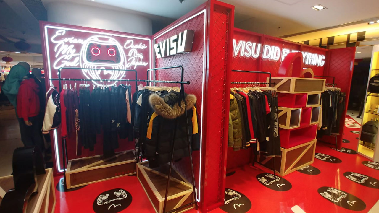
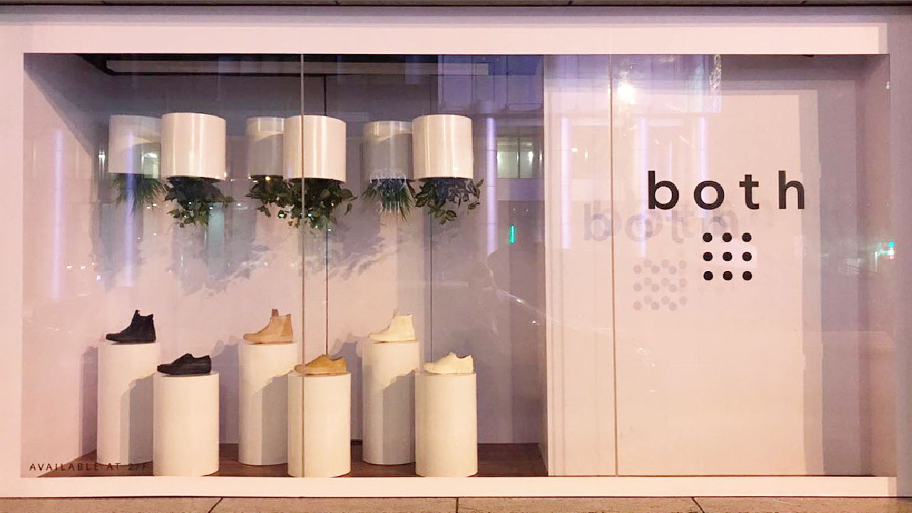
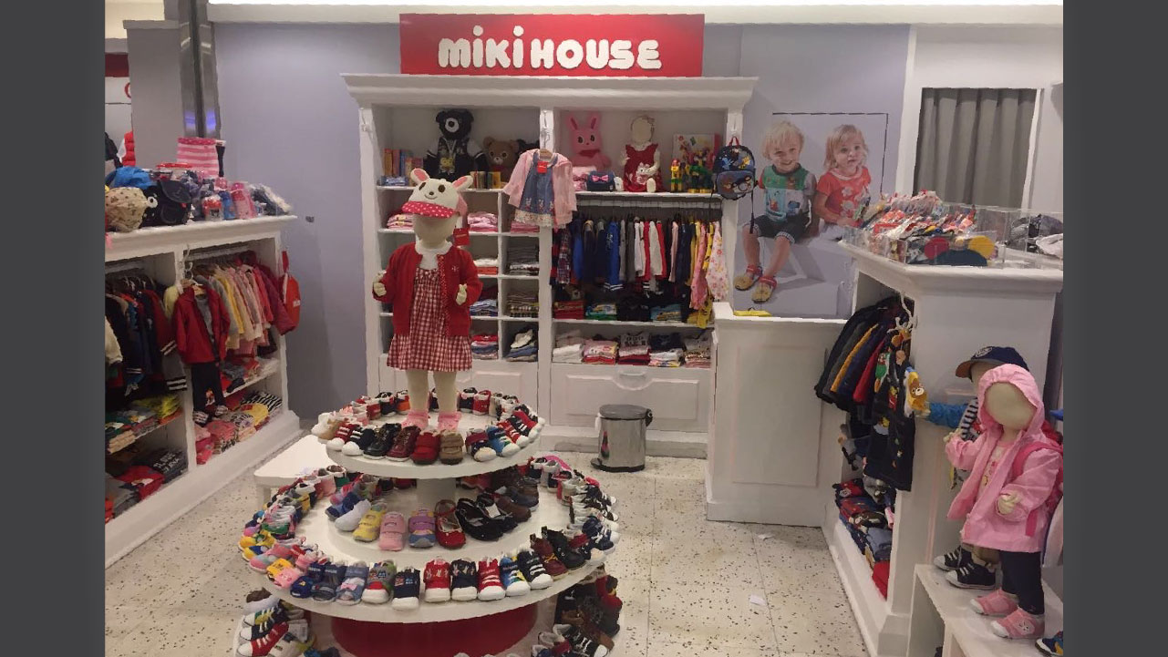
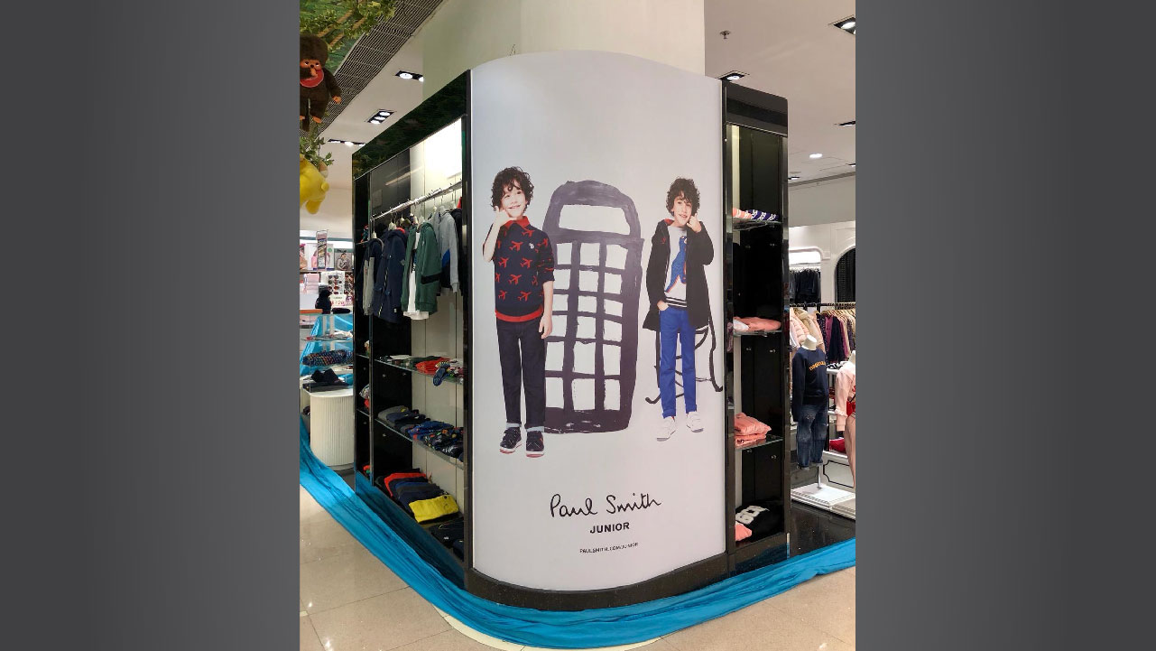
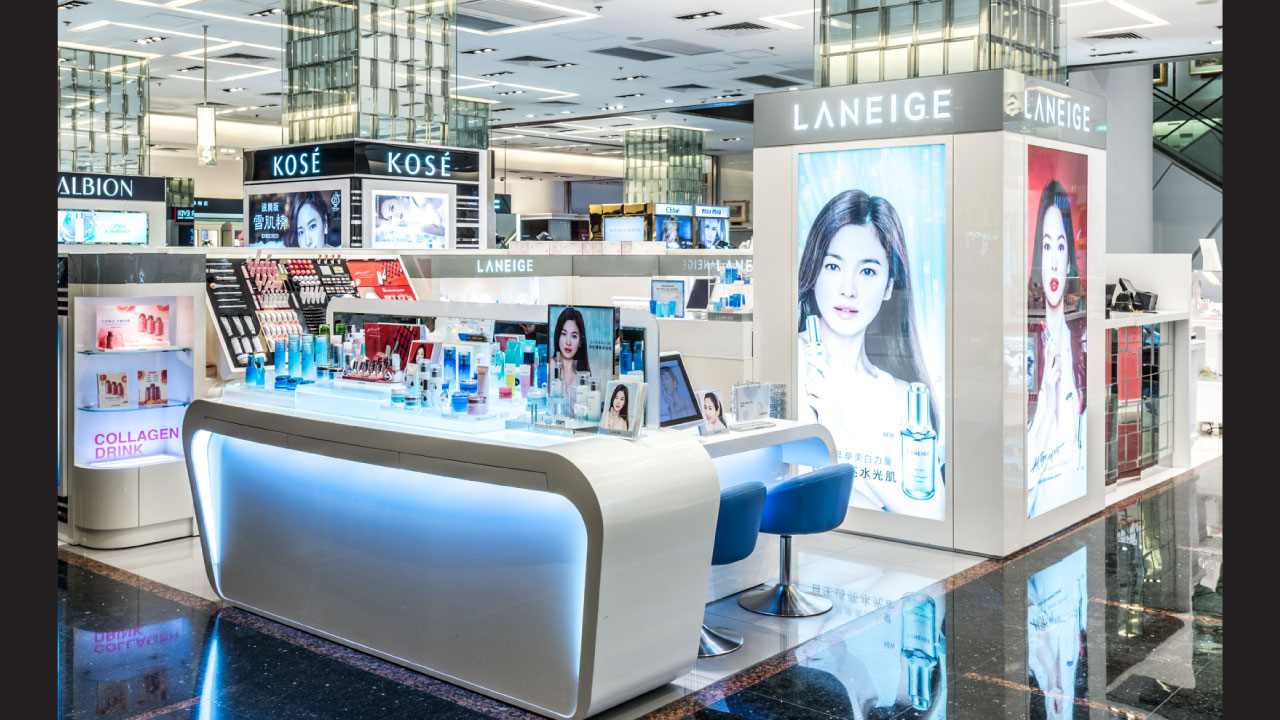
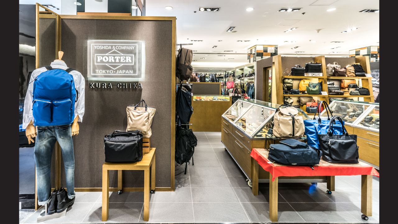
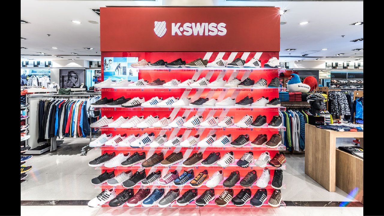
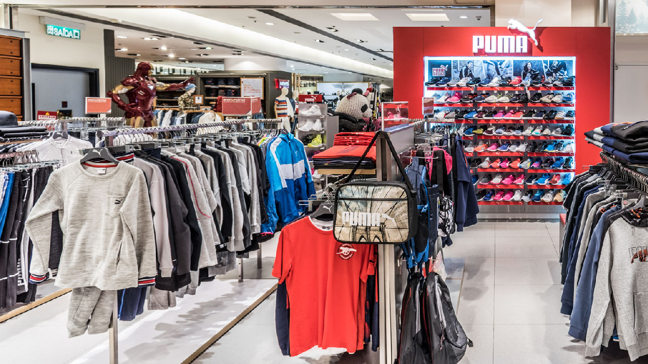
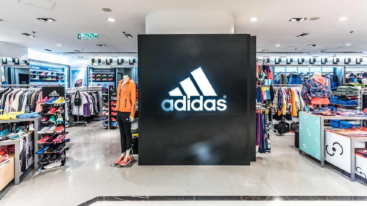
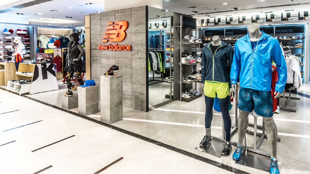
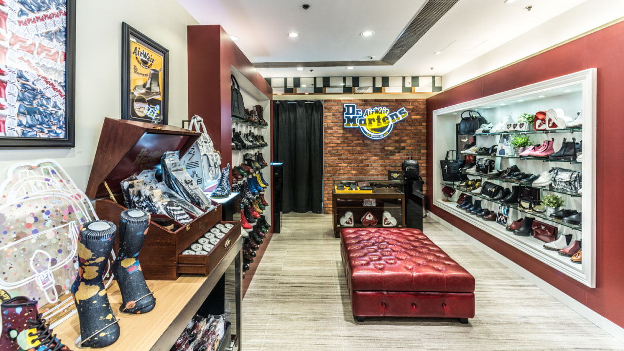
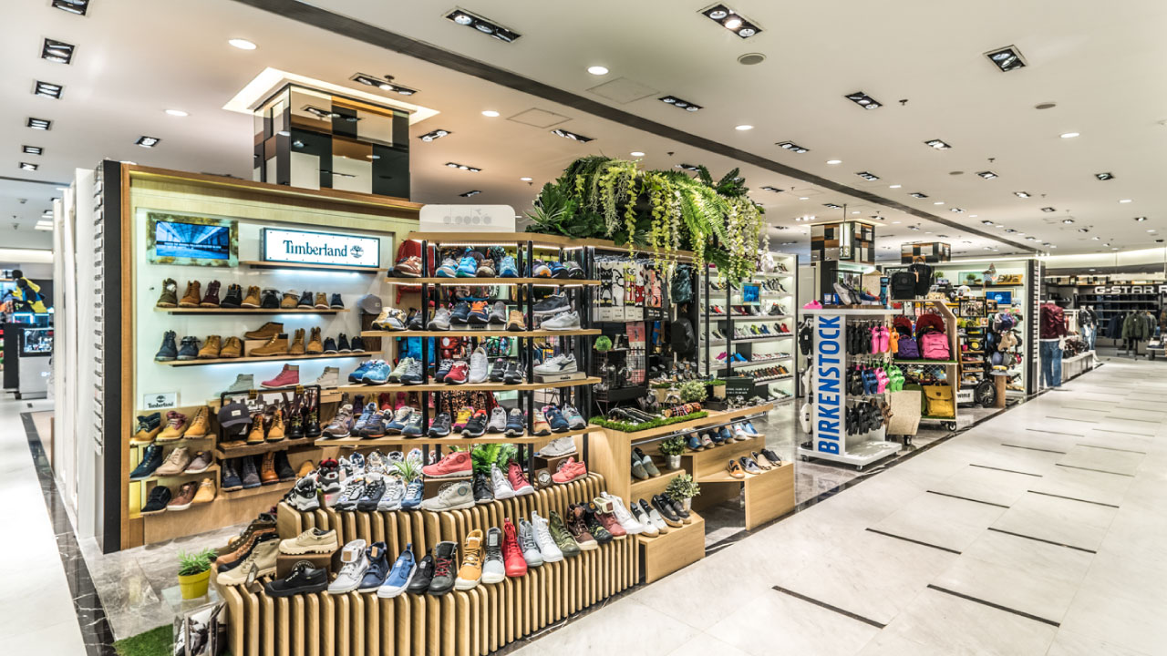
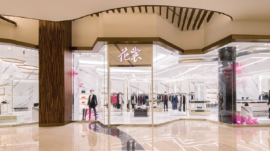
With extensive experience in window displays and visual merchandising, I have collaborated with globally renowned fashion brands, including Boy London, Diesel, Dr. Martens, Evisu Jeans, Harmont & Blaine, Kenzo, Lacoste, Lee, Levi’s, MCQ, Miki House, Munsingwear, and Paul Smith. My expertise lies in transforming brand aesthetics into captivating retail experiences, enhancing visual appeal and strengthening market presence for these iconic labels.
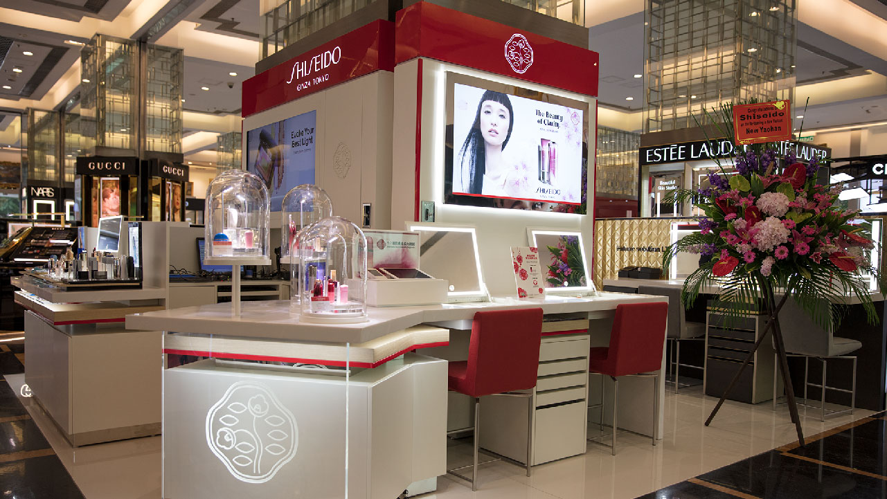
Client: Panda Sociedade de Gestão de Investimentos Limitada and Various Brand names | Project Management and Art Direction: Ken Yim | Store Fixtures Design: Ken Yim & VM Team
Kid’s Cavern was one of my favorite brand identity projects while working in the New Yaohan Department Store. It was a completely free-handed project for me to work on from the ground up. No string attached whatsoever! The system consists of all the tangible elements including the mascot character illustrations, shopping bags, type phrases, visual merchandising, and the marketing collaterals that make up the look and feel of the brand. The result is one of the most recognizable brands in the Greater Bay Area in China where its main competitor was the mighty Toy’s “R” Us. A strong brand leaves nothing to chance!
Client: Panda Sociedade de Gestão de Investimentos Limitada | Art Direction: Ken Yim | Visal Identity: Ken Yim | Illustration: Ken Yim | Animation Story Boarding: Ken Yim | Store Fixtures Design: Ken Yim & Team
